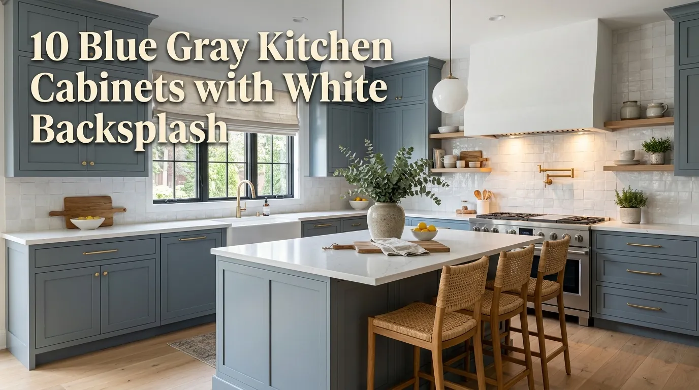
10 Blue Gray Kitchen Cabinets with White Backsplash
There’s a reason blue gray cabinetry paired with a white backsplash keeps showing up as one of the most-saved kitchen combinations year after year. In my experience, it’s one of the rare color pairings that reads as both timeless and current at the same time — moody enough to feel intentional, light enough to stay bright and livable. A mistake many homeowners make is choosing a cabinet color in isolation, without thinking through how it will actually interact with the backsplash, countertop, and hardware around it, and ending up with a kitchen that feels disjointed rather than cohesive.
I’ve noticed that the blue gray kitchens getting saved and shared the most right now share a common thread: a crisp white backsplash doing the quiet work of keeping the whole space feeling bright, while the cabinetry brings in depth, mood, and personality. That balance is what makes this combination so versatile — it works in a small galley kitchen just as well as it does in an open-concept great room, and it pairs easily with warm wood tones, brass hardware, or matte black fixtures depending on the overall style you’re after.
One thing that works especially well is treating the backsplash as the neutral, grounding element and letting the cabinet color carry most of the personality. That’s why many designers recommend finalizing your cabinet color first, then choosing a backsplash tile and pattern that complements it, rather than the reverse. Getting that order right is often the difference between a kitchen that feels put-together and one that feels like two separate decisions layered on top of each other.
This guide walks through ten ways to style blue gray cabinets with a white backsplash, covering tile patterns, hardware choices, countertop pairings, and the small details that pull the whole look together. Each idea includes practical guidance you can use whether you’re planning a full renovation or updating a few key elements. If you’re anything like me, you want specifics — not just inspiration — and that’s exactly what you’ll find below.
Table of Contents
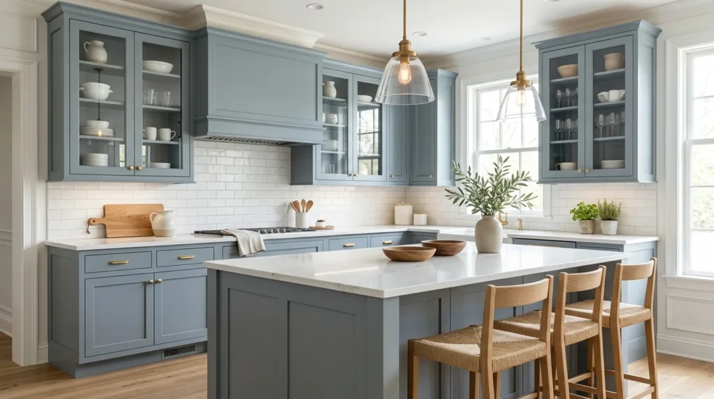
- Slate Blue Shaker Cabinets — The classic silhouette that anchors this entire look.
- Classic Subway Tile Backsplash — A timeless white tile pairing that never competes.
- Brass Hardware Accents — Warming up cool cabinetry with metallic contrast.
- Herringbone Tile Pattern — Adding movement and texture to a white backsplash.
- Matte Black Fixtures — A graphic, modern contrast against blue gray tones.
- Two-Tone Cabinet Contrast — Pairing blue gray uppers or lowers with a second tone.
- Marble-Look Countertops — Bridging cool cabinetry and a crisp white backsplash.
- Open Shelving Display — Breaking up cabinet runs with airy, styled display.
- Natural Wood Island — Introducing warmth into a cool-toned color scheme.
- Warm White Wall Paint — Choosing the right white to complete the palette.
1. Slate Blue Shaker Cabinets
Quick Benefits
- A timeless silhouette that won’t feel dated in a few years
- Reads as sophisticated without being overly trendy
- Works in both traditional and modern kitchen layouts
- Pairs easily with nearly any hardware finish
- Provides a strong, versatile base for the rest of the design
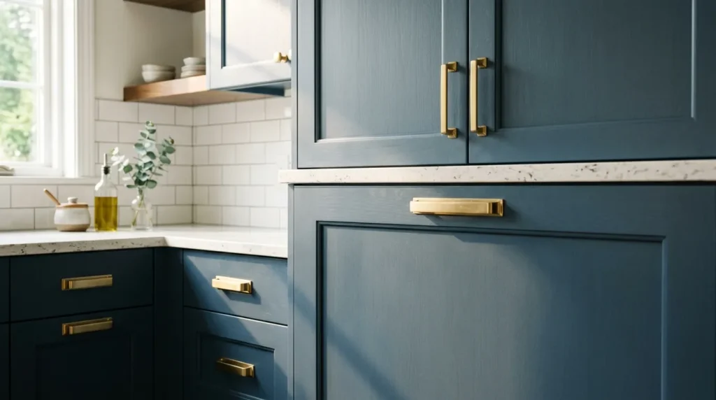
Why It Works In my experience, the shaker cabinet profile is what gives blue gray cabinetry its staying power. The simple, recessed-panel door style has remained a design staple for decades because it’s clean enough to feel modern and detailed enough to feel intentional, regardless of what color it’s painted. A mistake many homeowners make is pairing a bold or trendy cabinet color with an equally trendy door style, which tends to date a kitchen much faster than a classic silhouette in a more current color would.
How To Style It Choose a true slate or blue gray tone — something with enough gray undertone to keep it from reading as overly navy or teal — for the most versatile, long-lasting result. Shaker doors with a slightly wider rail and stile tend to look more substantial and high-end than a very thin, minimal profile. Pair with a white backsplash for contrast and brightness, and keep wall colors in the same cool-neutral family so the cabinetry remains the visual anchor of the room.
2. Classic Subway Tile Backsplash
Quick Benefits
- A timeless pairing that never competes with cabinet color
- Budget-friendly and widely available at every price point
- Reflects light well, keeping the kitchen feeling bright
- Easy to install in a variety of layout patterns
- Works in both traditional and modern kitchen styles
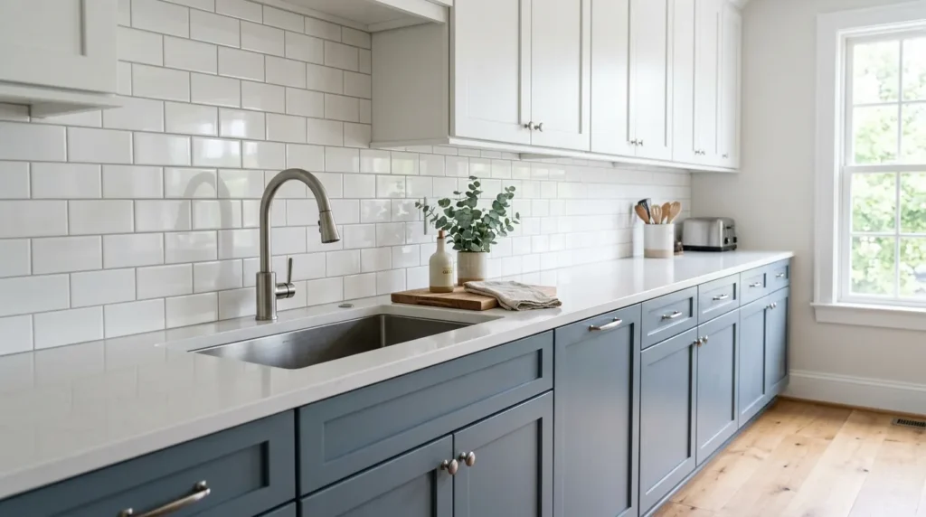
Why It Works Classic white subway tile is one of the most reliable backsplash choices specifically because it does its job quietly. I’ve seen this idea transform blue gray cabinetry from feeling heavy or moody into feeling fresh and balanced, simply because the crisp white grid keeps the eye moving and the room feeling bright. That’s why many designers recommend subway tile as a starting point for anyone nervous about committing to a bold cabinet color — it’s the safest, most proven way to keep a cool-toned kitchen from feeling closed in.
How To Style It A classic running-bond subway pattern in a 3-by-6-inch tile is the most timeless option, though a slightly larger format tile reduces grout lines for an even cleaner look. Choose a white or off-white grout close to the tile color for a seamless, monochromatic backsplash, or a soft gray grout for subtle definition between tiles. Extend the tile to the underside of upper cabinets or, for a more dramatic look, all the way to the ceiling behind open shelving or a range hood.
3. Brass Hardware Accents
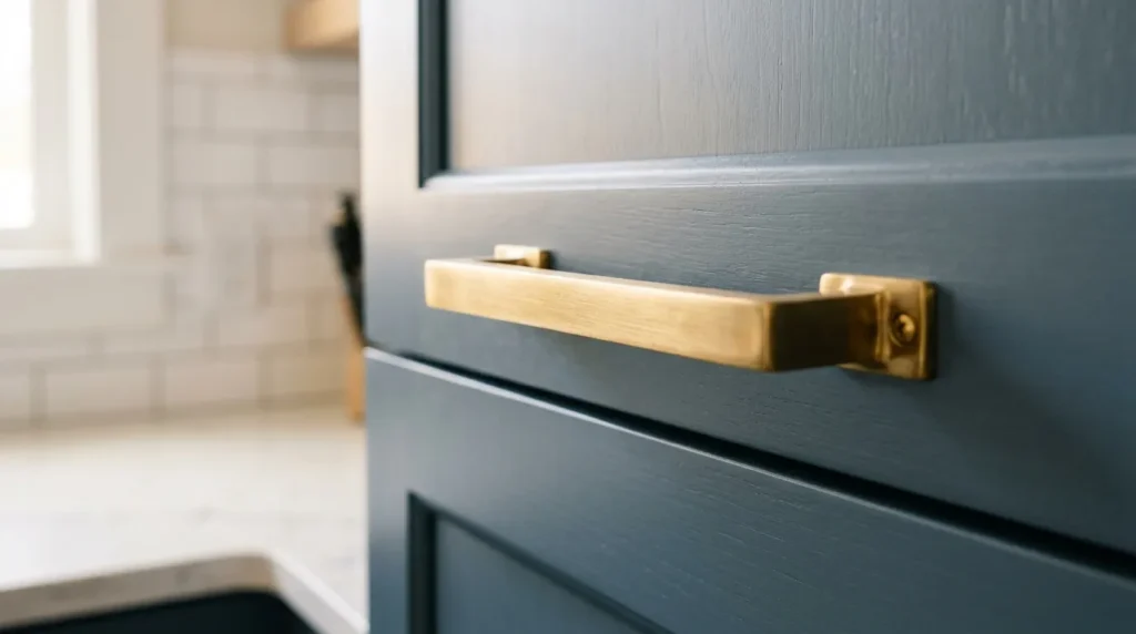
Quick Benefits
- Warms up naturally cool blue gray cabinetry
- Adds a subtle, upscale finishing touch
- Works across pulls, knobs, faucets, and lighting
- Bridges cool cabinetry with warm wood or brass fixtures elsewhere
- A relatively affordable way to elevate the whole kitchen
Why It Works One thing that works especially well against a cool cabinet color is a warm metal finish, and brass is the most popular choice for good reason. Blue gray tones can occasionally feel a little cold or clinical on their own, and brass hardware introduces exactly the kind of warmth needed to balance that out. In my experience, this small detail change — swapping chrome or nickel pulls for brass — often has a bigger visual impact than homeowners expect, given how little it costs relative to the rest of a kitchen renovation.
How To Style It Choose unlacquered or brushed brass for a softer, more livable patina that develops character over time, or polished brass for a brighter, more formal look. Use brass consistently across cabinet pulls, the faucet, and pendant lighting for a cohesive feel, rather than mixing several different metal tones. If a full hardware swap isn’t in the budget, start with just the cabinet pulls and knobs, which touch nearly every part of the kitchen visually.
4. Herringbone Tile Pattern
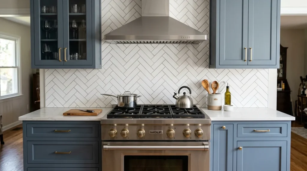
Quick Benefits
- Adds movement and texture to an otherwise simple white backsplash
- Elevates the kitchen without introducing new color
- Works well as a focal-point feature behind a range or sink
- Pairs beautifully with both modern and traditional cabinetry
- A moderate step up in visual interest from standard subway tile
Why It Works A herringbone-patterned backsplash takes the same crisp white palette as a classic subway tile but arranges it in a way that adds genuine visual energy to the kitchen. I’ve noticed this pattern especially often behind a range or cooktop, where it functions as a natural focal point without needing a bold color. A mistake many homeowners make is assuming more visual interest requires more color; herringbone tile proves that pattern alone, even in a single neutral tone, can add real depth and movement to a space.
How To Style It Use a rectangular subway-style tile laid in a 45-degree herringbone pattern for the most classic version of this look, ideally concentrated behind the range as a focal feature rather than across the entire backsplash. Keep grout in a soft white or light gray to maintain the clean, monochromatic effect. Pair with simple, unadorned cabinet hardware so the tile pattern remains the star of that particular wall, while the rest of the kitchen stays visually calmer.
5. Matte Black Fixtures
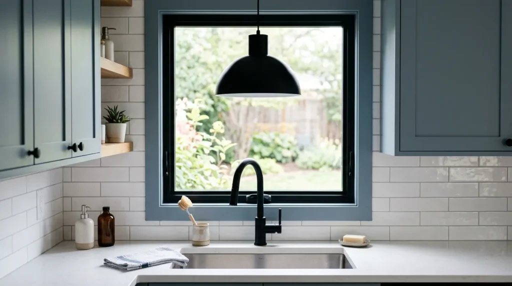
Quick Benefits
- Adds graphic, modern contrast against blue gray cabinetry
- Works especially well in more contemporary kitchen styles
- Grounds a light, cool-toned palette with visual weight
- Pairs easily with white backsplash tile
- A popular, widely available finish across fixtures
Why It Works Where brass adds warmth, matte black does the opposite job just as effectively: it adds contrast, definition, and a distinctly modern edge. In my experience, matte black fixtures against blue gray cabinets and a white backsplash create one of the most striking, editorial-feeling kitchen palettes available, because the black provides sharp visual punctuation against an otherwise soft, cool color scheme. That’s why many designers recommend this pairing specifically for kitchens leaning modern or transitional rather than traditional or farmhouse in style.
How To Style It Choose matte black for the faucet, cabinet hardware, and any pendant lighting for a cohesive, intentional look, rather than mixing black with another accent metal. Matte black window frames or a black-framed piece of art on an adjacent wall can extend the contrast beyond just the fixtures. Keep countertops and backsplash grout on the lighter side to maintain balance — too much black alongside dark blue gray cabinetry can start to feel heavy rather than crisp.
6. Two-Tone Cabinet Contrast
Quick Benefits
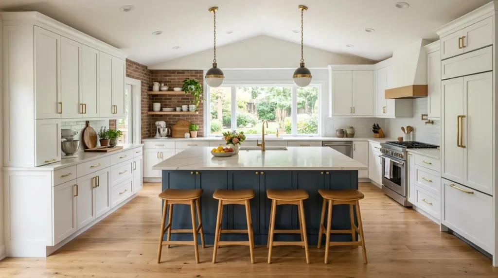
- Adds visual interest without overwhelming the whole kitchen
- Allows blue gray to feel like a considered accent, not the default
- Works especially well on kitchen islands
- Breaks up large cabinet runs visually
- Popular for both small and large kitchen layouts
Why It Works A mistake many homeowners make is assuming every cabinet in the kitchen needs to match. Two-tone kitchens — often a blue gray island paired with white or cream perimeter cabinetry — have become one of the most requested layouts because they let a bolder color feel special and intentional rather than overwhelming an entire room. I’ve seen this idea transform kitchens that felt too monochromatic into spaces with real depth and a clear visual focal point, usually centered on the island.
How To Style It Paint the island in blue gray while keeping the surrounding perimeter cabinetry in white or a soft warm white, which lets the island read as a true statement piece. Alternatively, use blue gray on lower cabinets throughout the kitchen with white uppers, a classic combination that keeps the upper portion of the room feeling bright and open. Tie the two tones together with consistent hardware and countertop material throughout, so the contrast feels planned rather than mismatched.
7. Marble-Look Countertops
Quick Benefits
- Bridges cool cabinetry and a crisp white backsplash seamlessly
- Adds subtle pattern and visual richness
- Available in budget-friendly quartz and laminate options
- Reflects light well, keeping the kitchen feeling open
- Pairs with both warm and cool hardware finishes
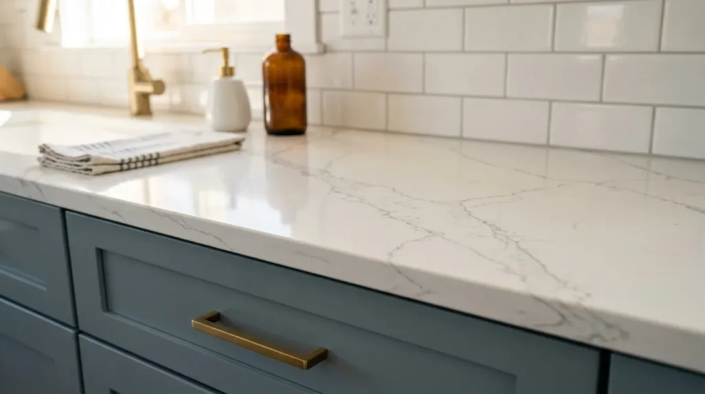
Why It Works Marble-look countertops — whether genuine marble, quartz, or a laminate alternative — do important connective work in a blue gray and white kitchen, since their soft veining typically pulls tones from both the cool cabinetry and the bright white backsplash. In my experience, this is what keeps the whole palette feeling like one cohesive design rather than three separate decisions stacked on top of each other. One simple trick I always suggest is choosing a countertop with subtle gray veining specifically, which echoes the cabinet color just enough to tie the whole room together.
How To Style It Quartz options that mimic Carrara or Calacatta marble offer the same soft white-and-gray veining as natural stone with significantly less maintenance, making them a practical choice for busy kitchens. Keep veining soft and subtle rather than heavily patterned, which tends to compete less with the cabinetry and backsplash. Pair with a simple waterfall edge on an island for a more modern, high-end look, or a classic eased edge for a more traditional feel.
8. Open Shelving Display
Quick Benefits
- Breaks up long cabinet runs with airy visual relief
- Creates opportunities for styled, personal display
- Makes a kitchen feel more open and less boxy
- Pairs beautifully with both wood and metal bracket finishes
- An affordable partial alternative to full upper cabinetry
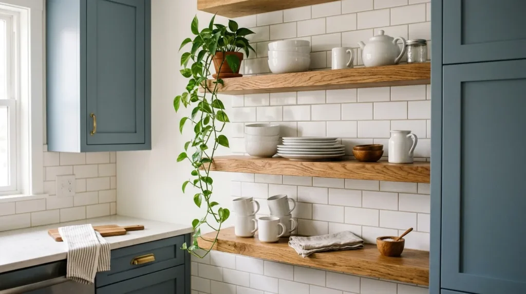
Why It Works Replacing one or two sections of upper cabinetry with open shelving is a popular way to soften an otherwise heavy run of blue gray cabinets. I’ve noticed that this works especially well flanking a range hood or above a sink, where the openness draws the eye upward and keeps the kitchen from feeling boxed in by continuous cabinetry. A mistake many homeowners make is converting too much of the kitchen to open shelving, which can feel impractical for daily use; one or two sections is usually enough to achieve the visual benefit.
How To Style It Wood shelves in a warm tone contrast nicely against blue gray cabinetry and a white backsplash, adding a natural material into the mix. Style shelves with a mix of everyday dishware in white or cream tones, a few plants, and one or two decorative objects, keeping the arrangement editted rather than crowded. Simple black or brass brackets tie the shelving back to whichever hardware finish you’ve chosen elsewhere in the kitchen.
9. Natural Wood Island
Quick Benefits
- Introduces warmth into a cool-toned color palette
- Creates a strong, furniture-like focal point
- Balances blue gray perimeter cabinetry effectively
- Adds texture without introducing additional color
- Works across modern, transitional, and farmhouse styles
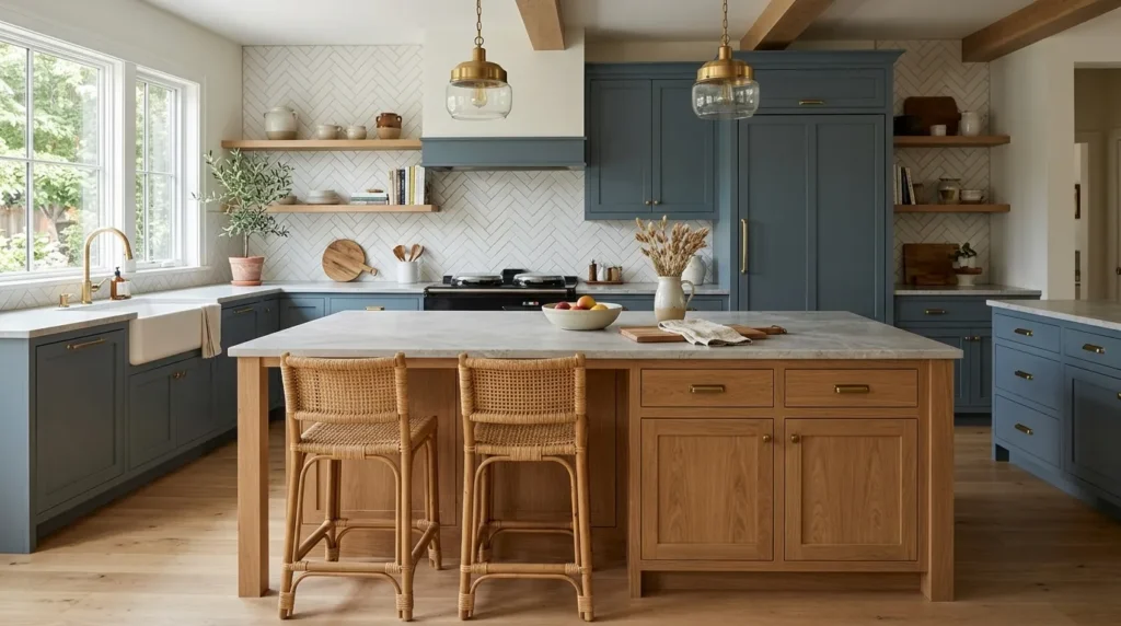
Why It Works A blue gray and white kitchen, while beautiful, can occasionally lean cool without a warming element somewhere in the mix. In my experience, a natural wood island is one of the most effective ways to introduce that warmth, since it functions almost like a piece of furniture rather than built-in cabinetry, adding both material contrast and a sense of approachability to an otherwise crisp, cool-toned space. That’s why many designers recommend a wood island specifically as the third material in this palette, alongside the blue gray cabinetry and white backsplash.
How To Style It Choose a warm wood tone — white oak or walnut are both popular — for the island base, keeping the surrounding perimeter cabinetry in blue gray for contrast. A butcher block or wood-topped island countertop extends the warmth further, though a lighter stone or quartz top also works well if you want the wood contained to the cabinetry itself. Add woven bar stools or brass pendant lighting above the island to reinforce the warm, organic note the wood introduces.
10. Warm White Wall Paint
Quick Benefits
- Completes the palette without introducing a new color
- Prevents the kitchen from feeling overly cool or clinical
- Easy, affordable final layer to any kitchen update
- Works well with both brass and black hardware finishes
- Ties wall color, backsplash, and cabinetry into one cohesive scheme
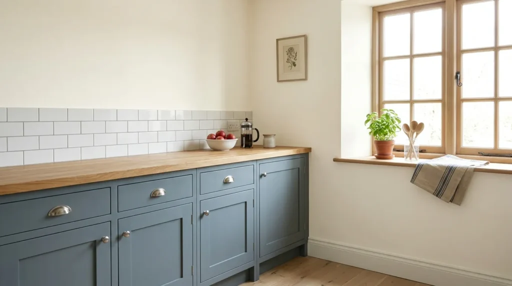
Why It Works A mistake many homeowners make is choosing a stark, cool white for kitchen walls to match a white backsplash, which can push an already cool blue gray palette even further into feeling clinical or sterile. In my experience, a slightly warmer white — with a hint of cream or beige undertone rather than a true cool white — does a lot of quiet work to balance the coolness of the cabinetry and keep the whole room feeling inviting rather than stark. This is often the very last decision made in a kitchen design, but it has more influence on the overall mood than most people expect.
How To Style It Choose a warm white or off-white paint with subtle cream undertones for walls and trim, testing samples in your kitchen’s actual lighting before committing, since undertones can shift dramatically between natural and artificial light. Keep ceiling color a shade lighter than the walls, in the same warm-white family, to maintain a bright, cohesive feel overhead. If your backsplash tile is a cooler, starker white, leaning slightly warmer on the wall paint creates just enough separation to keep each element visually distinct rather than blending together.
Frequently Asked Questions
Does blue gray cabinetry work in a small kitchen? Yes, especially when paired with a white backsplash and light countertops, which help balance the depth of the cabinet color. Keeping walls in a warm white and maximizing natural light also helps a small kitchen feel open rather than closed in.
What hardware finish works best with blue gray cabinets? Both brass and matte black work well, depending on the overall style you’re after — brass adds warmth and a softer, more traditional feel, while matte black adds graphic, modern contrast. The right choice largely comes down to personal preference and the rest of your fixtures.
Should the backsplash and countertop match exactly? They don’t need to match exactly, but choosing pieces with a shared undertone — for example, a white backsplash and a countertop with soft gray veining — tends to create a more cohesive, intentional look than pairing two unrelated whites.
Is blue gray cabinetry a passing trend? Blue gray has remained a popular, enduring choice for several years now, largely because it functions more like a sophisticated neutral than a bold, trend-driven color. Paired with a classic shaker door style, it tends to age well rather than feeling dated quickly.
What wood tone pairs best with blue gray cabinets? Warm tones like white oak and walnut tend to pair especially well, since they provide contrast against the cooler cabinetry without competing with it. Avoid orange-toned or heavily yellow wood tones, which can clash with blue gray’s cooler undertones.
Can I do a two-tone kitchen with just paint, without new cabinets? Yes, painting existing cabinetry is one of the most budget-friendly ways to achieve a two-tone look, particularly painting just the island a different color from the surrounding perimeter cabinets. This works well as a weekend or long-weekend project for many homeowners.
What’s the most budget-friendly way to get this look? Painting existing cabinets in a blue gray tone and adding a simple white subway tile backsplash are typically the two most affordable ways to achieve this palette without a full renovation. Updating just the hardware afterward can further refine the look for relatively little cost.
Final Thoughts
Blue gray cabinetry paired with a white backsplash remains one of the most reliable, versatile kitchen color combinations because it balances mood and brightness so effectively. Whether you lean toward brass warmth or matte black contrast, classic subway tile or a herringbone feature, each of these ten ideas builds on the same dependable foundation.
Start with one or two ideas and gradually build a space that reflects your style and supports everyday comfort. The goal isn’t a showroom-perfect kitchen — it’s one that feels balanced, bright, and genuinely yours to cook and gather in.
Related Articles
- 10 Modern Living Room Ideas with Natural Wood Finishes
- Neutral Home Styling on a Budget
- 10 Bathroom Decor Ideas That Add Everyday Luxury
- Modern Farmhouse Decor Ideas for Every Room
- DIY Accent Wall Ideas Anyone Can Do